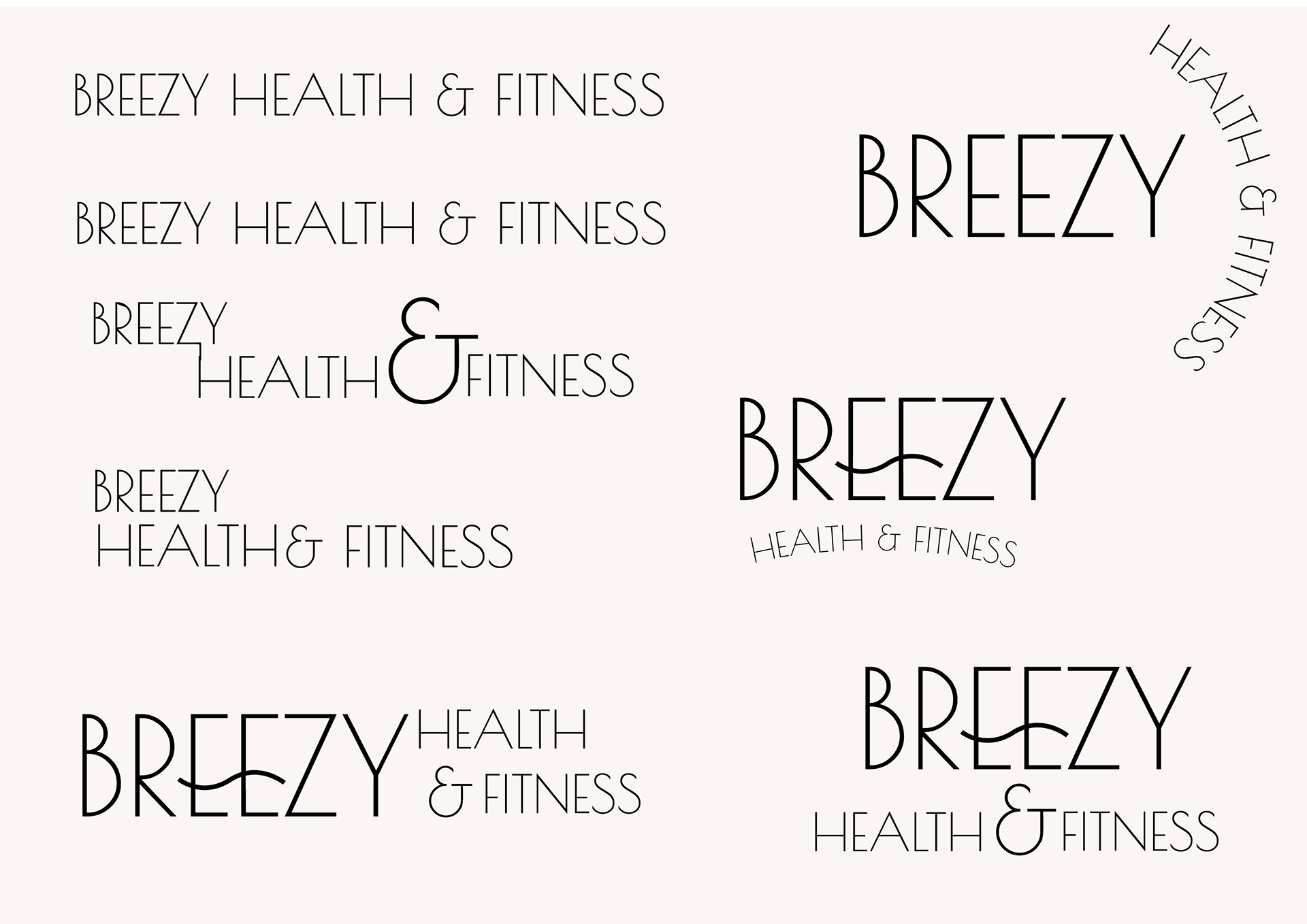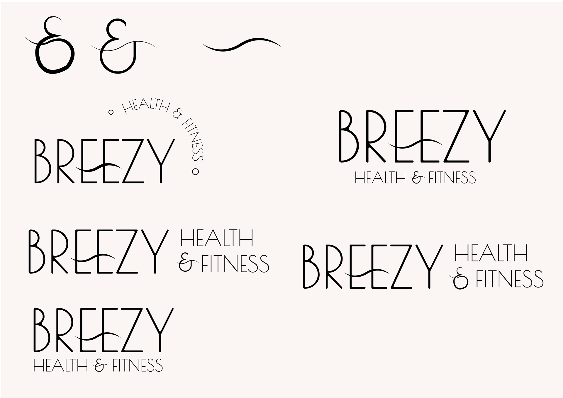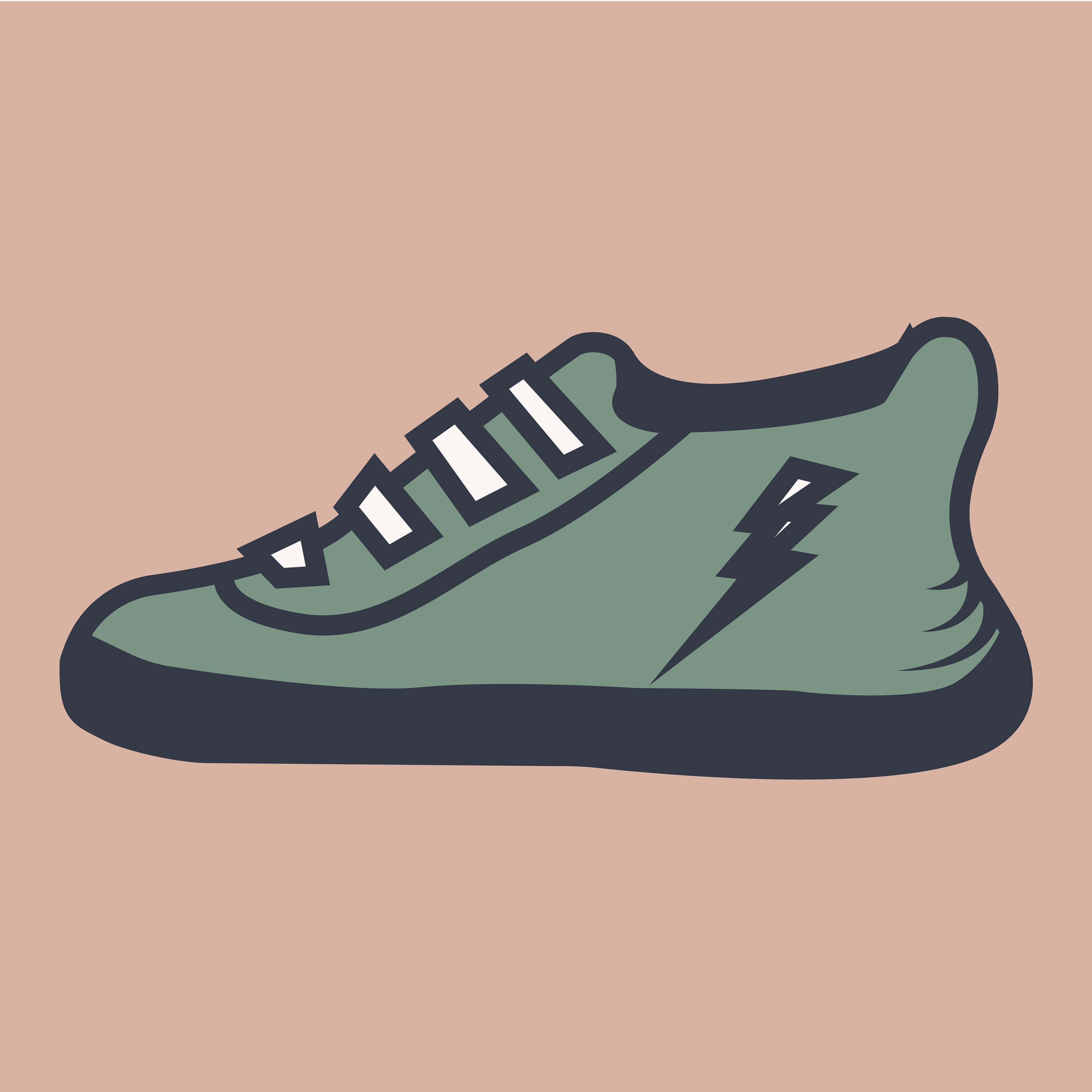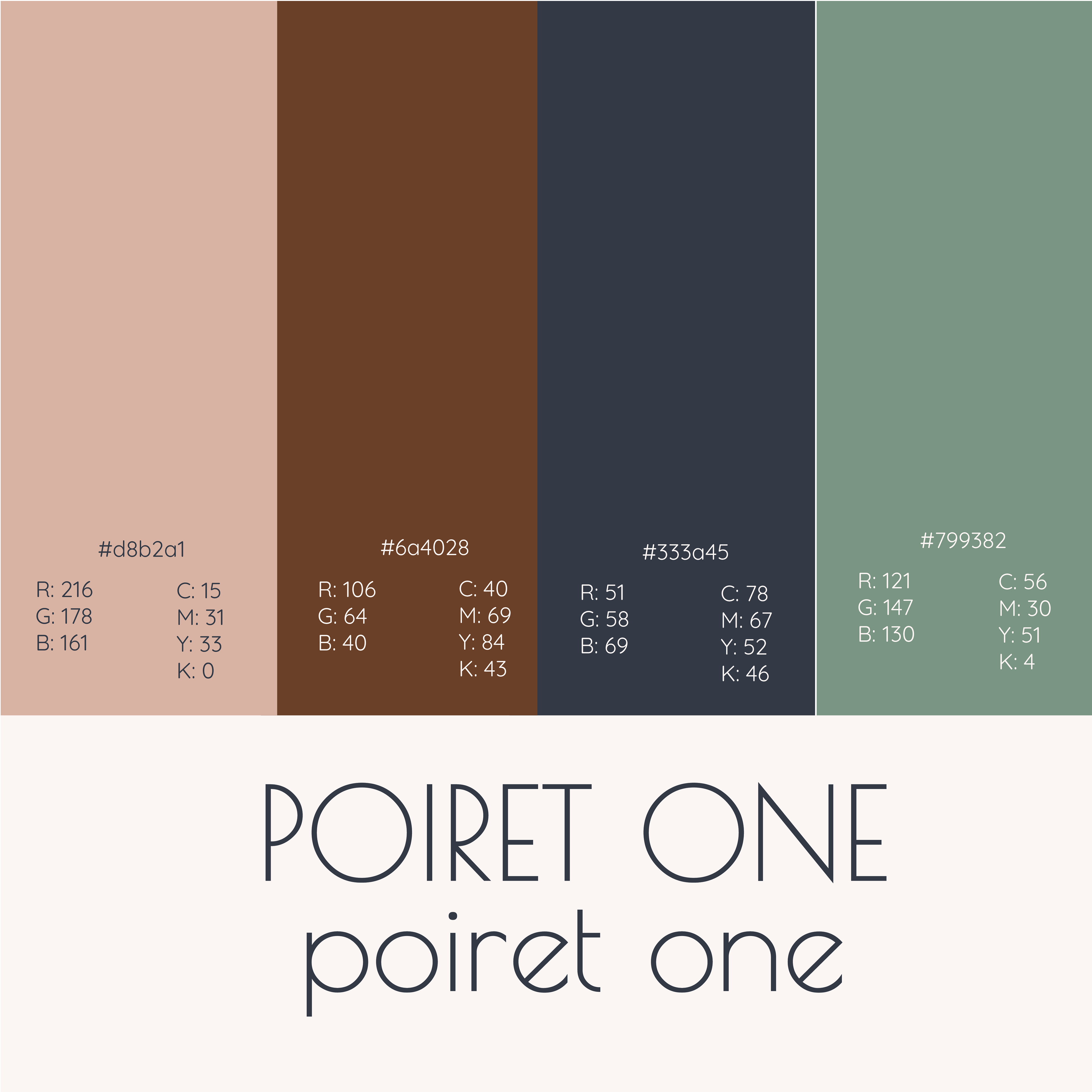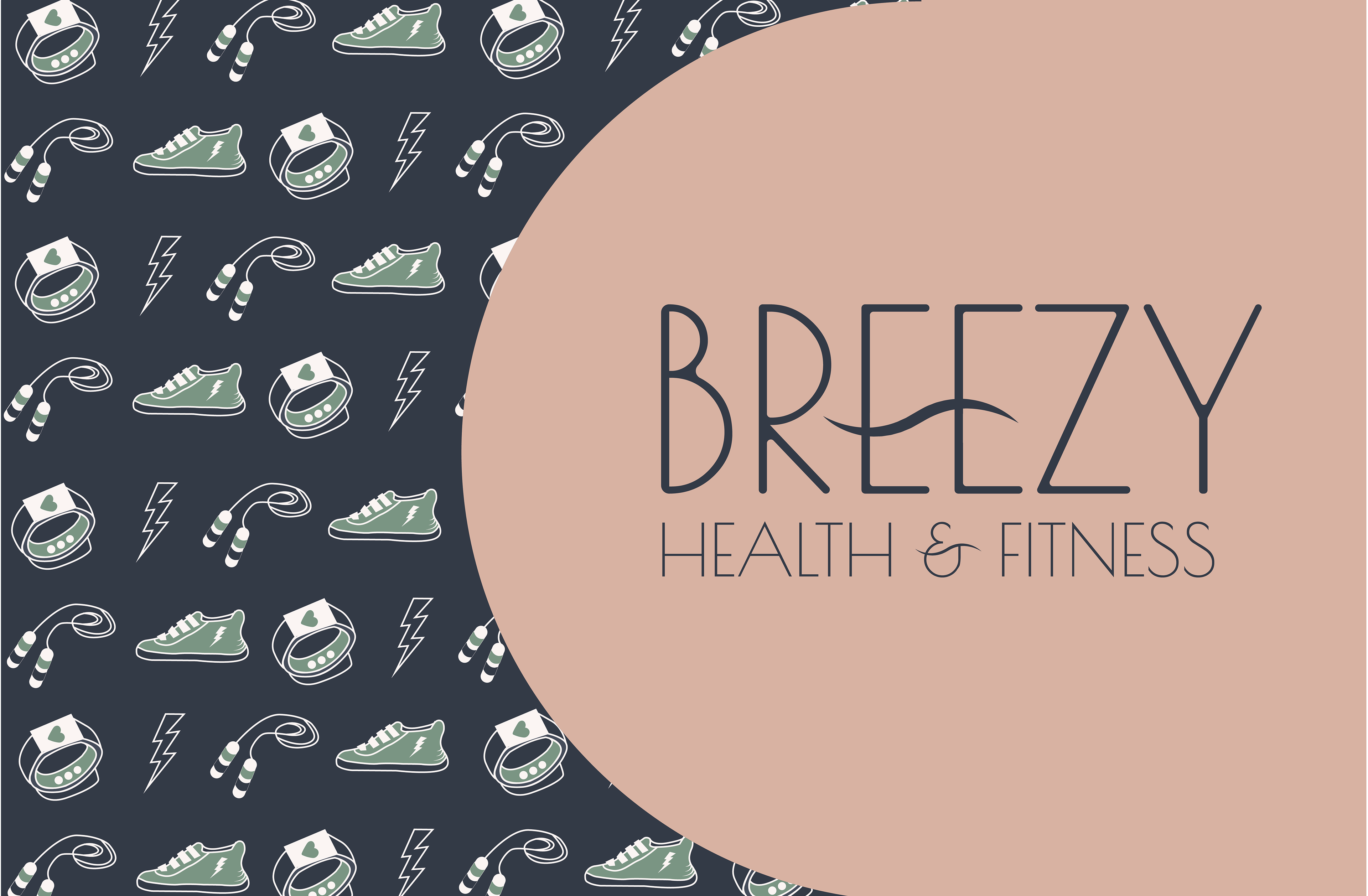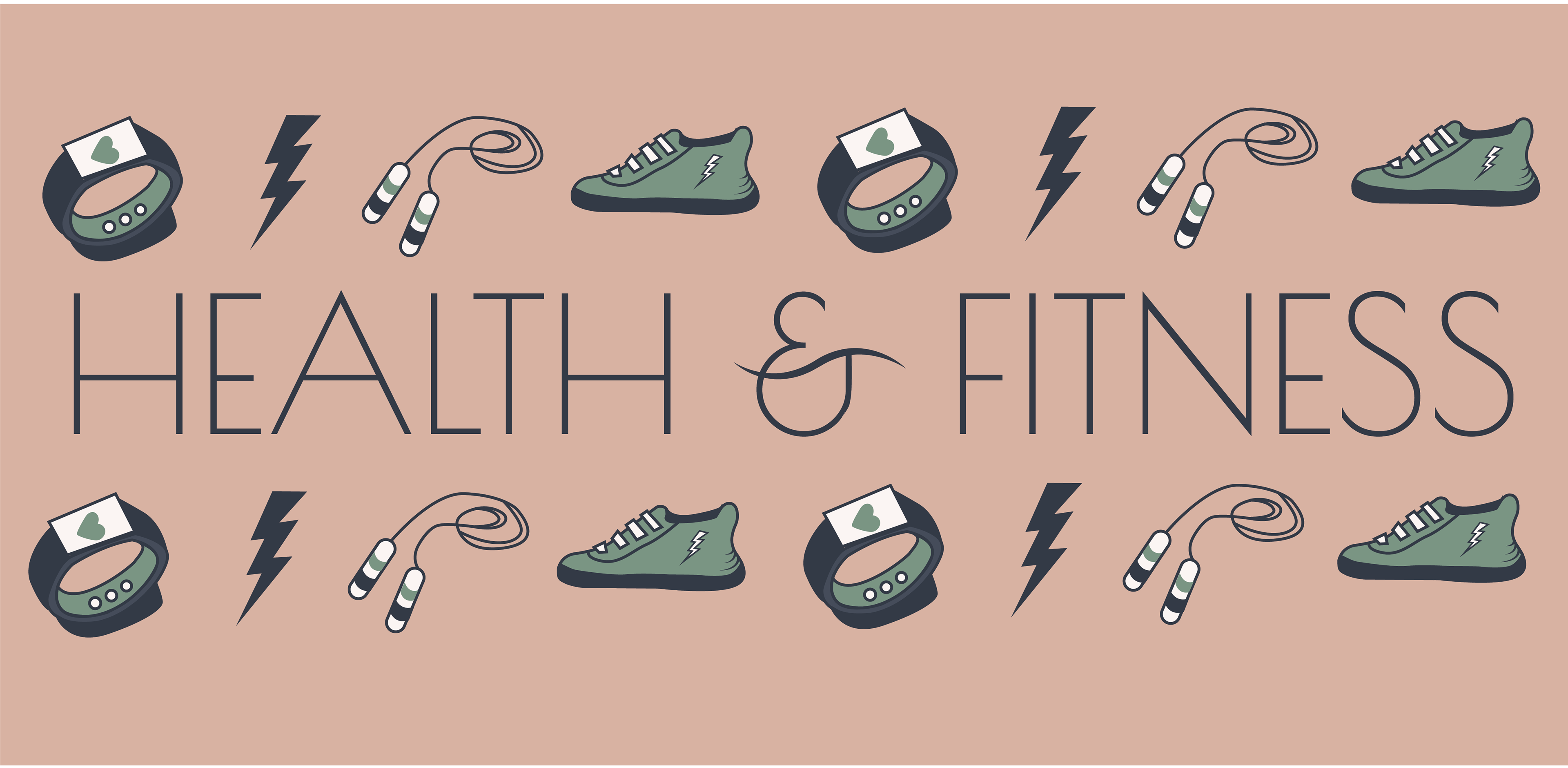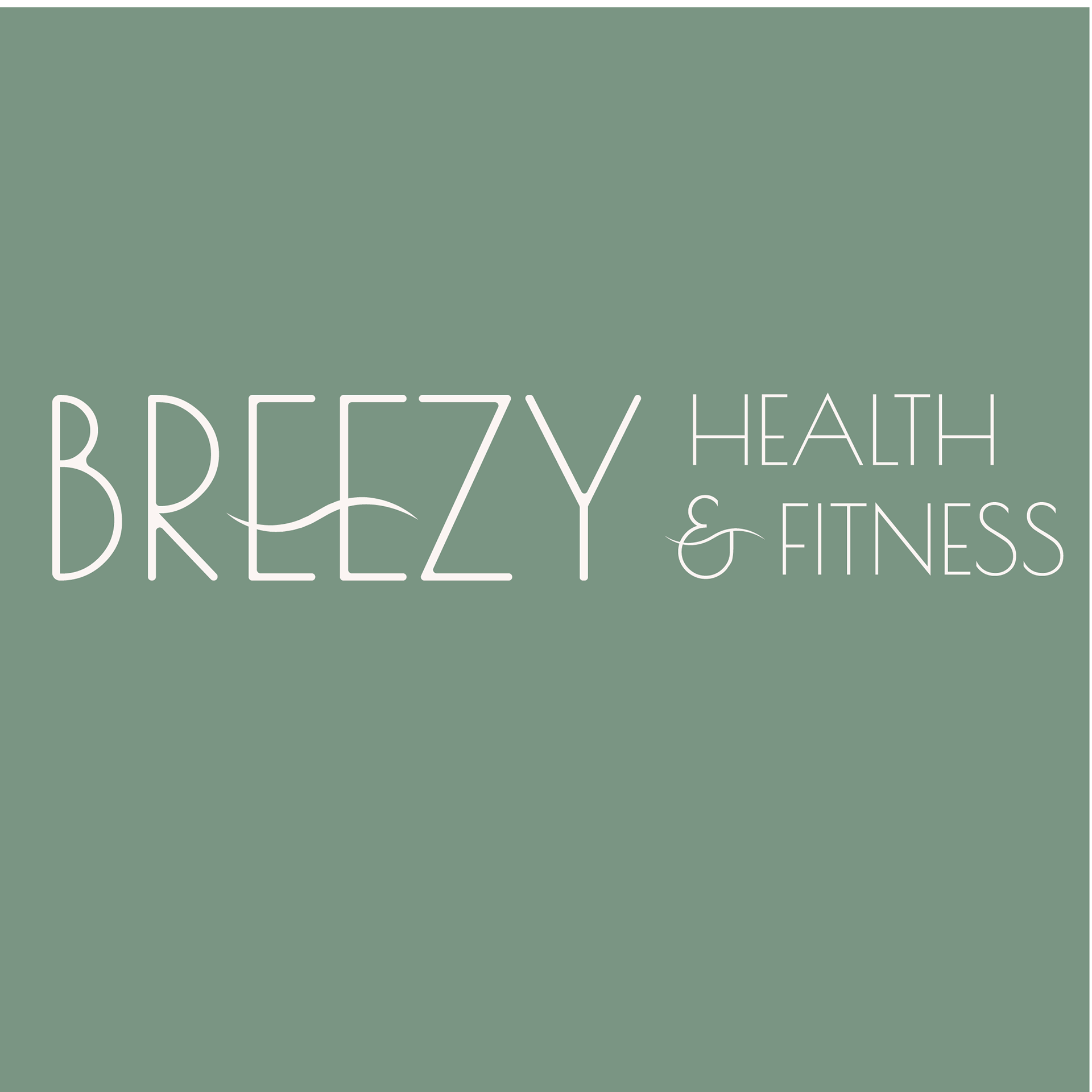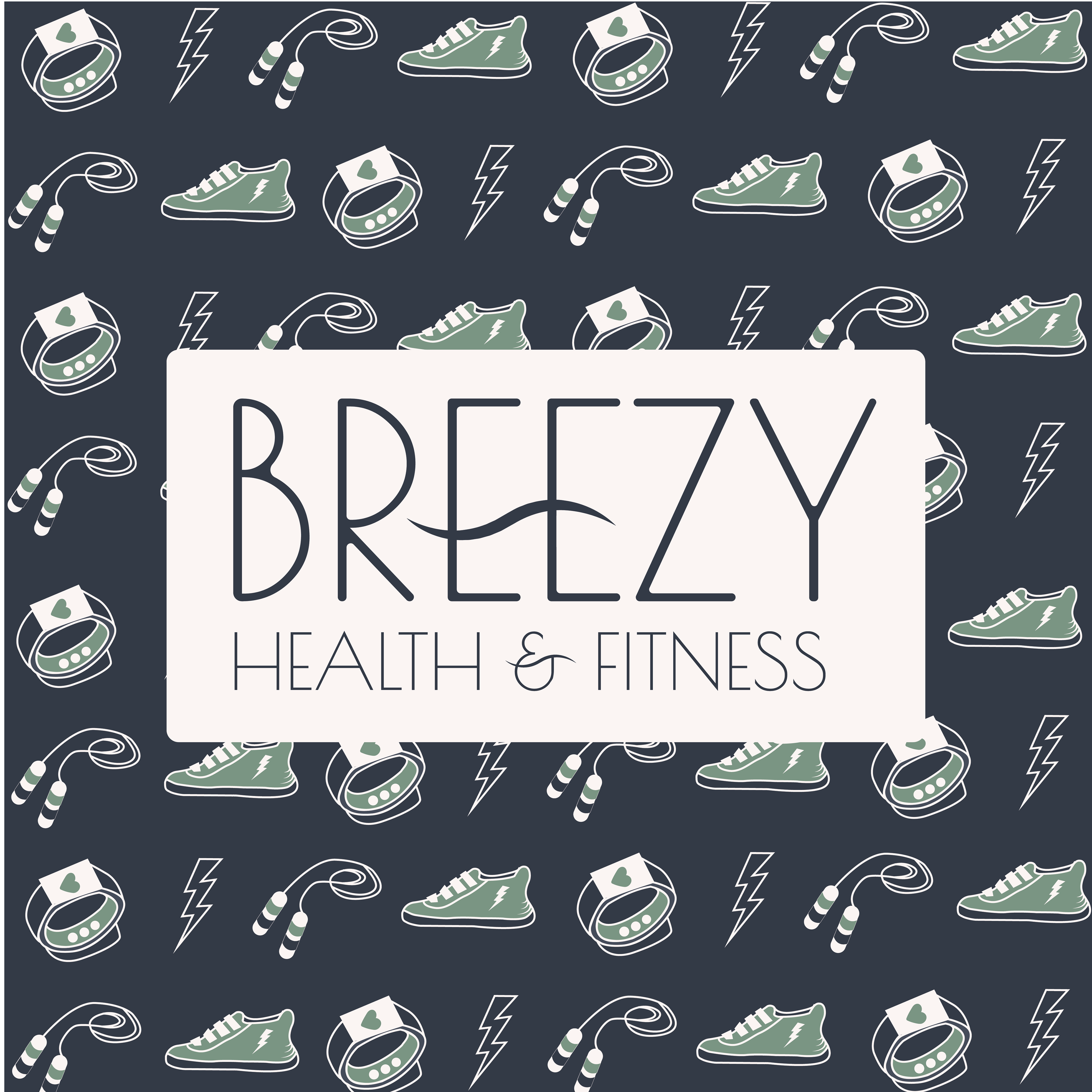
Breezy Health and Fitness is a brand focusing on healthy living and fitness. Starting with the key characteristics of the brand, I was able to better understand the key elements of this brand, allowing me to explore colour and typefaces. The colours demonstrate empowerment to the clients of the brand and really reflect these characteristics. The wave element in the logo ties in with the word breezy as in a breeze. This element is also used for the ‘&’.